Product icons
Product icons
Product icons
Product icons
A decorative icon set and style for Epsilon’s product suite.
A decorative icon set and style for Epsilon’s product suite.
A decorative icon set and style for Epsilon’s product suite.
A decorative icon set and style for Epsilon’s product suite.
Epsilon • Icon design • 2020
Epsilon • Icon design • 2020
Epsilon • Icon design • 2020
Epsilon • Icon design • 2020
Overview
The Epsilon product suite was shifting to a more visual presence for our customer service representative (CSR) and marketer audiences. We had also conducted usability testing and found that users felt that the UI was “dry,” “needed to be more visually interesting” and “plain”.
We decided to introduce a decorative icon style to bring more visual interest into the products.
Team
I worked with one UX manager and a project manager.
I worked with one UX manager and a project manager.
Role and what I did
Lead visual designer
Created rough sketches and refined them into vector icons
Finalized a cohesive gradient style, color palette, and outlines
Lead visual designer
Created rough sketches and refined them into vector icons
Finalized a cohesive gradient style, color palette, and outlines
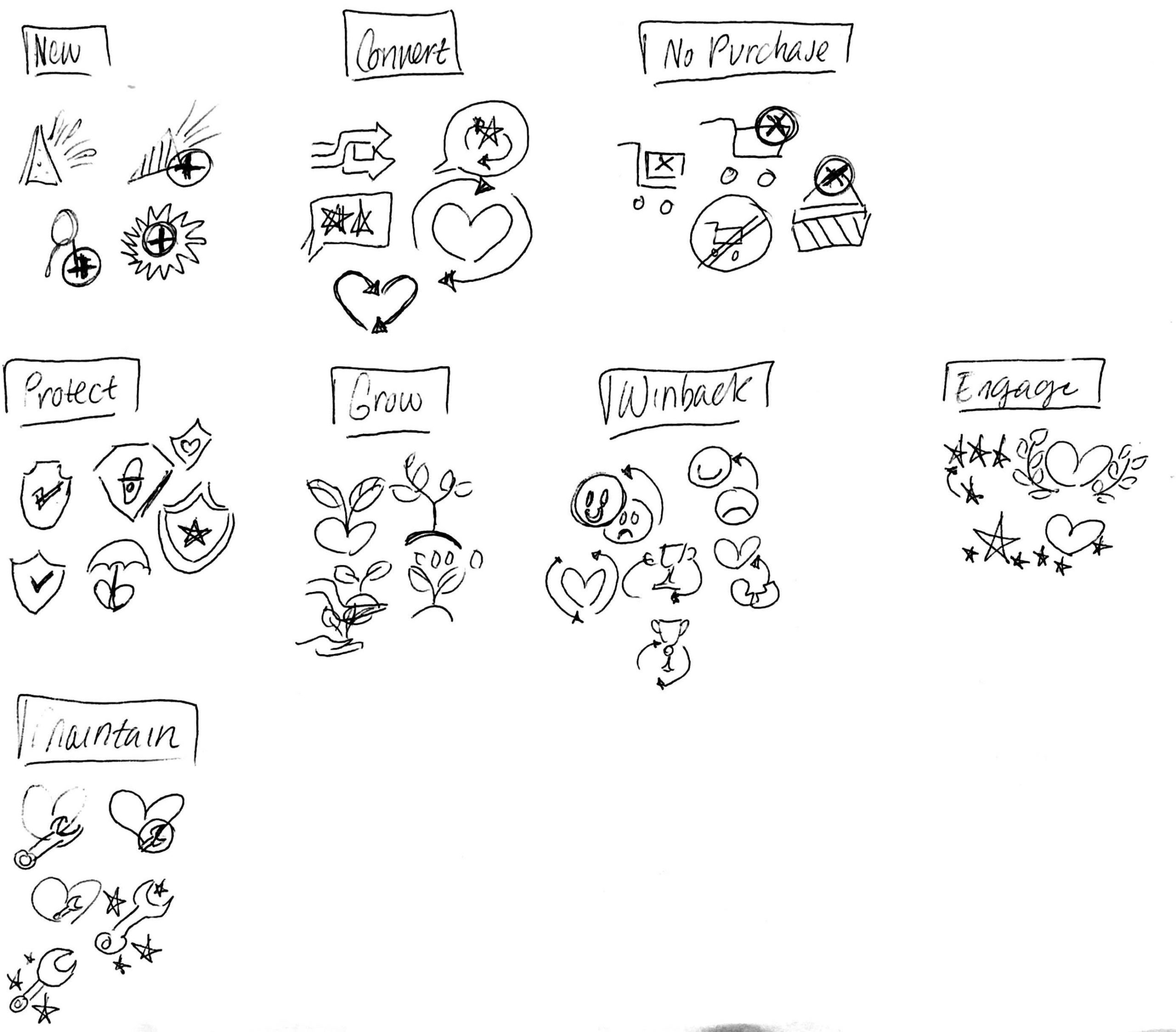
Sketching
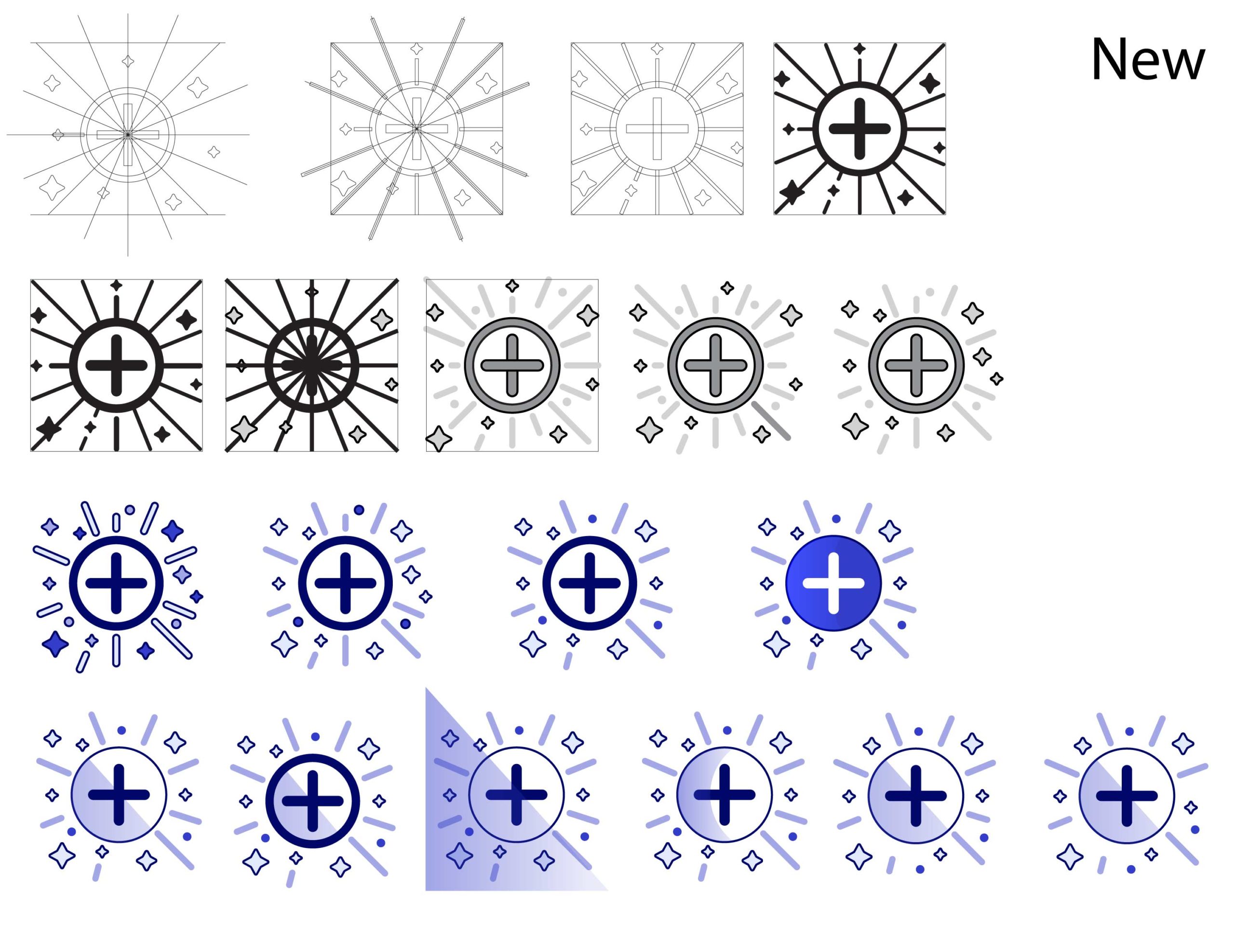
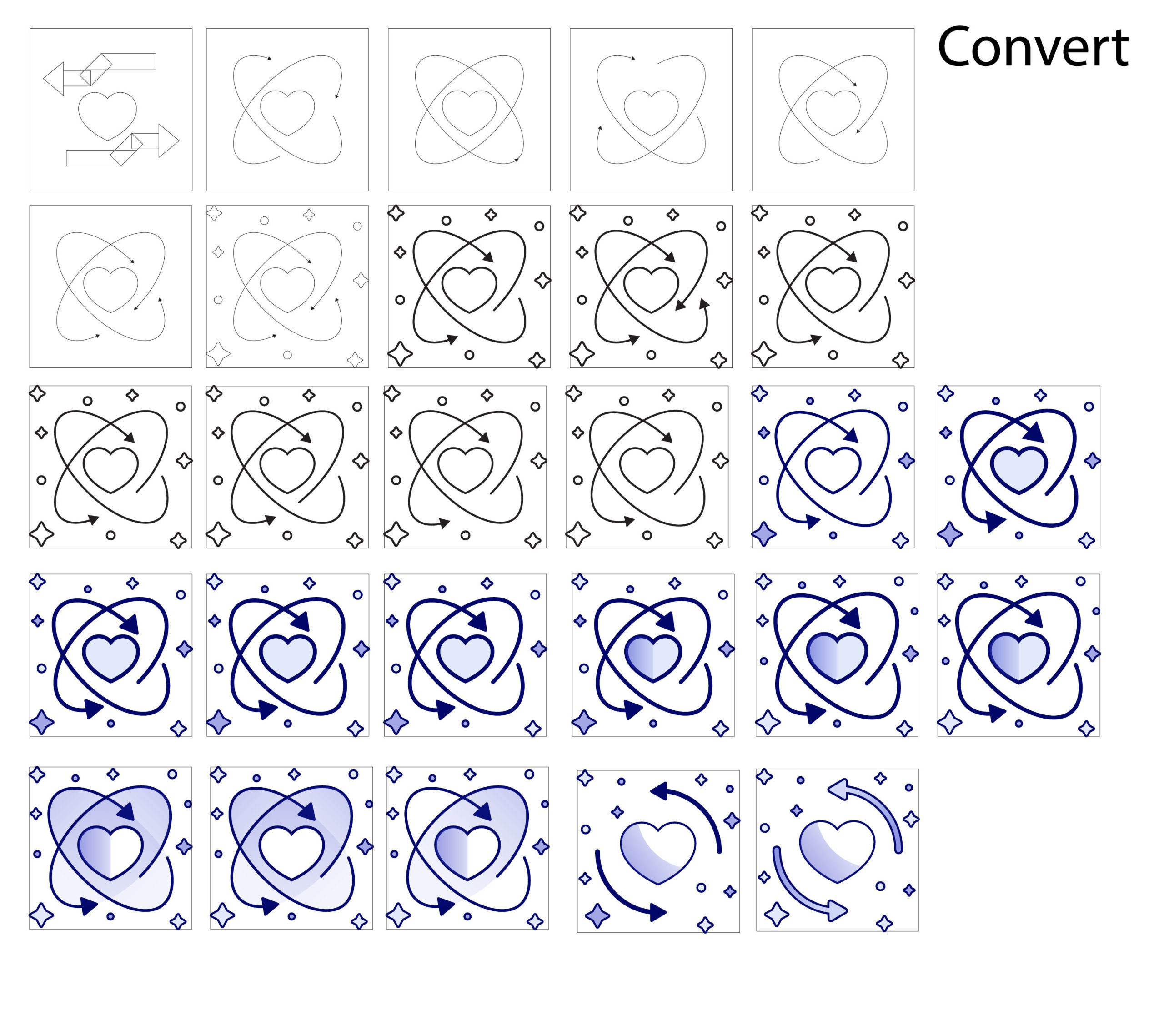
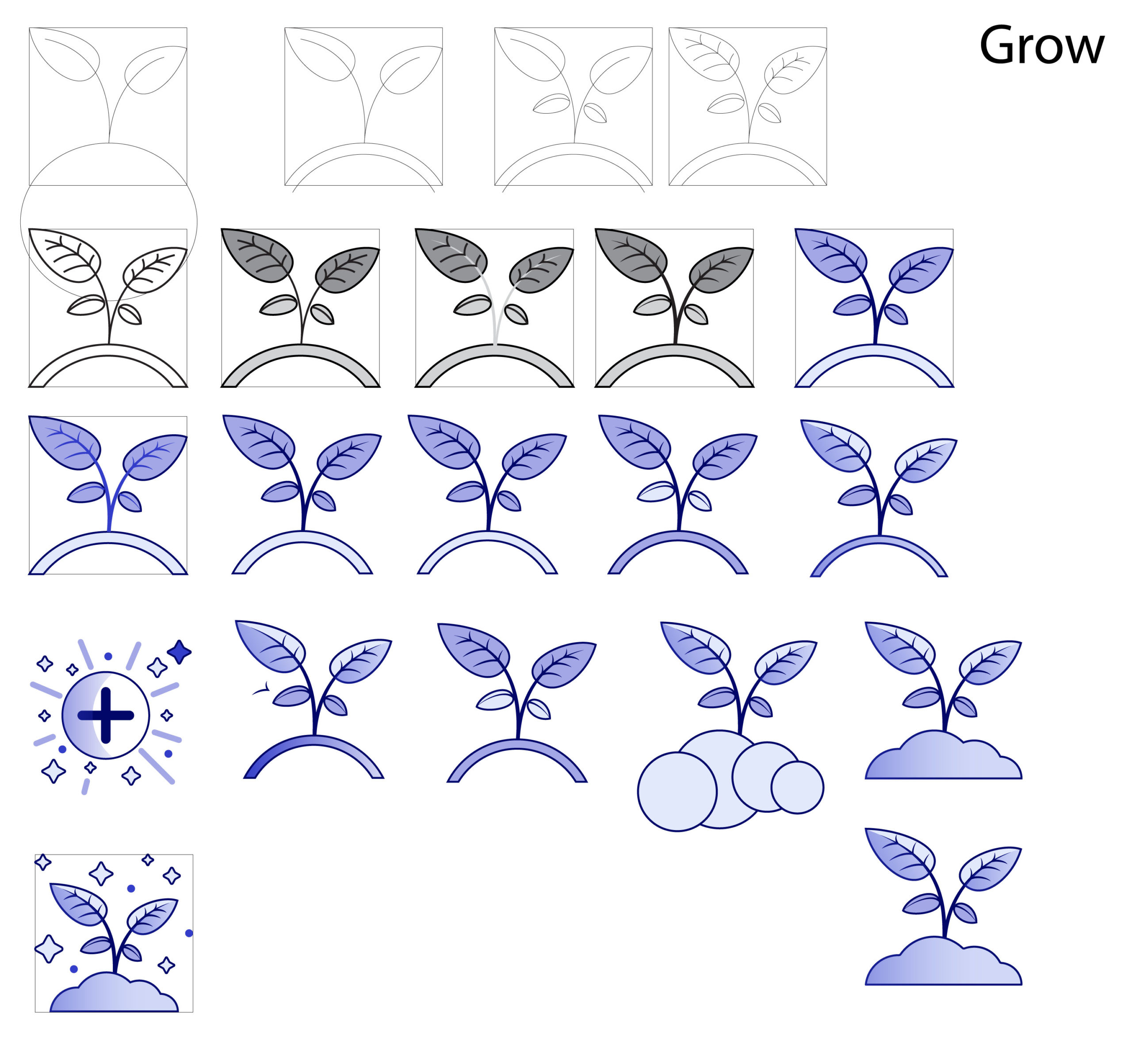
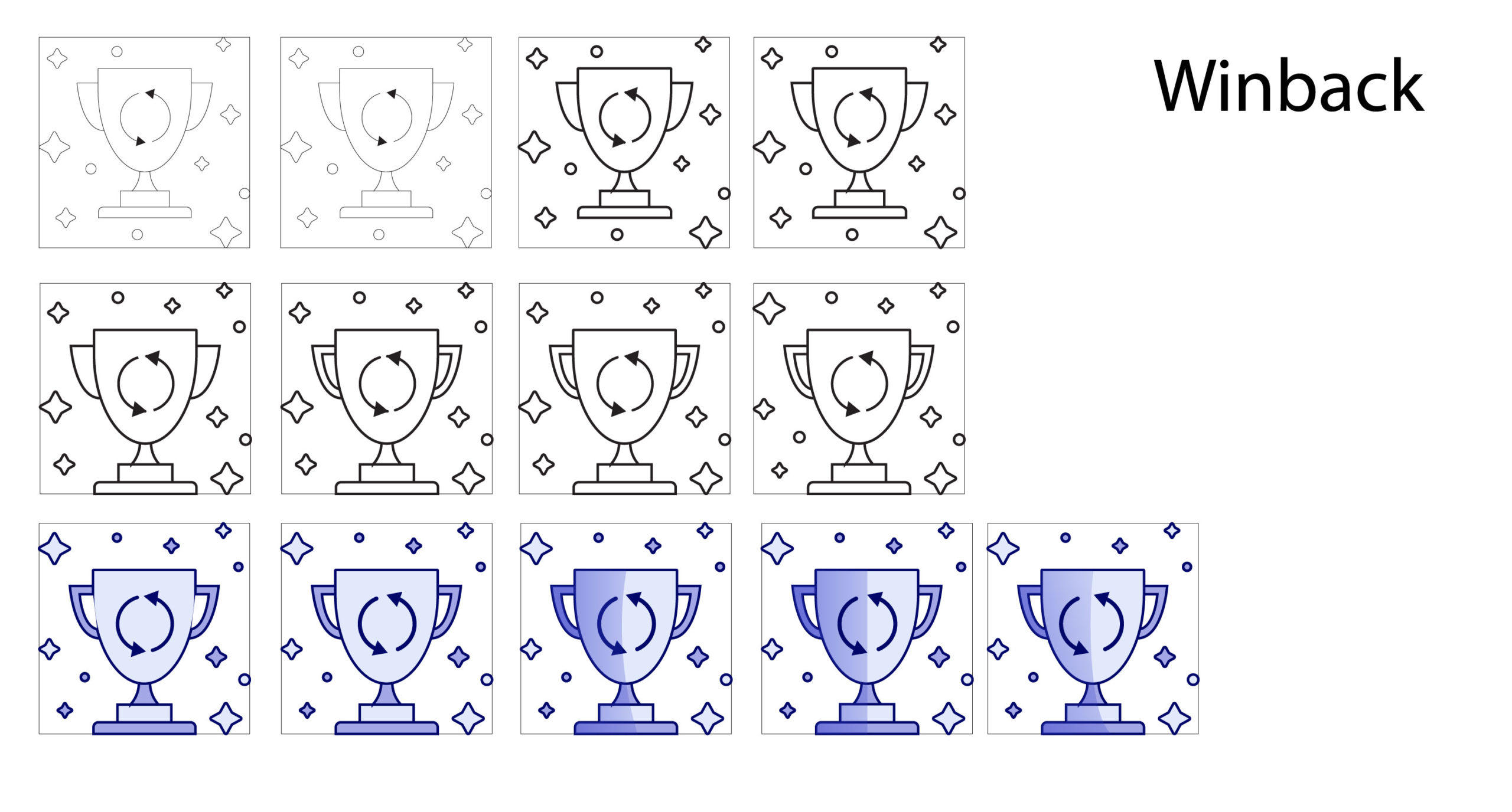
Loyalty customer segments icons
These icons represent a member’s current customer segment within the loyalty program. The segment is listed next to the icon. The icons had to be more abstract to represent the various niche segments.
These icons represent a member’s current customer segment within the loyalty program. The segment is listed next to the icon. The icons had to be more abstract to represent the various niche segments.
Promotions icons
These icons are more straightforward as they represent actual things. The icons help to show options to choose from when building a promotion.
These icons are more straightforward as they represent actual things. The icons help to show options to choose from when building a promotion.
Refining
I met with the larger UX team to get their sign off on thumbnail proposals and moved into Illustrator.
I ended up created more icons than we needed to begin with. These will be used when we include more customer segments to the loyalty program.
I met with the larger UX team to get their sign off on thumbnail proposals and moved into Illustrator.
I ended up created more icons than we needed to begin with. These will be used when we include more customer segments to the loyalty program.
Finalizing
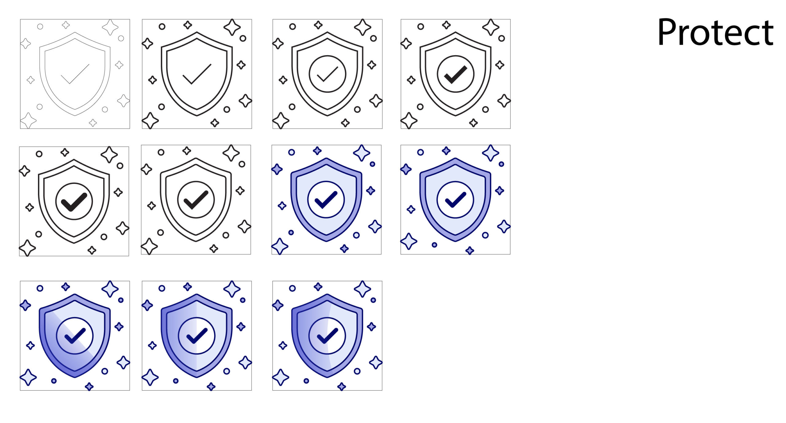
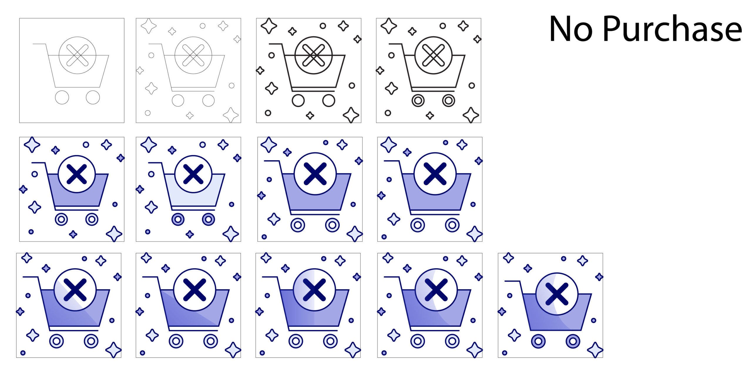
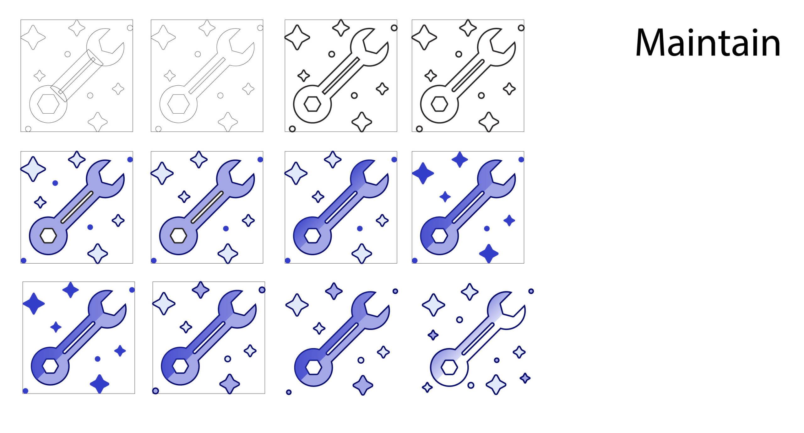
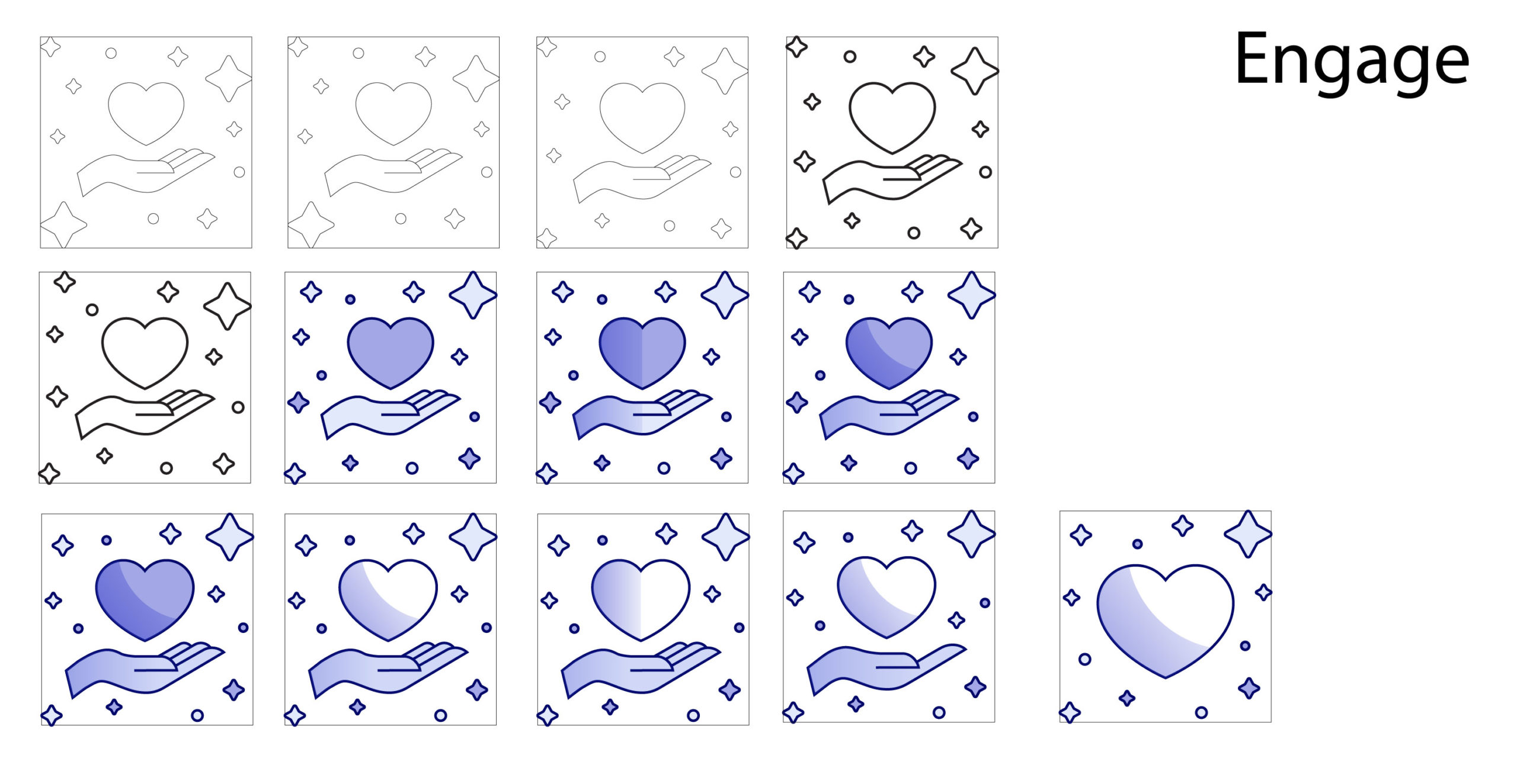
The color palette is secondary to our action-blue range, but still complements the cooler color range. The purple shades are softer and help to integrate the icon into the UI.
Promotions
We settled on two sets of icons; one for Promotion Types and one for Promotion Channels.
Types
What the user wants to use to communicate with their audience.
Channels
How the user wants to communicate to their audience.
Loyalty customer segments
Customer segments
A segment is assigned depending on the customer’s activity within a loyalty program. Each of the segments are represented by an icon.
Tile variations
The segment's icon, name, description, and scores appear in a tile on the customer dashboard. The score evaluates the customer’s activity and determines which segment they belong to.

Expand / collapse information
The customer's previous activity falls into three categories. These scores determine the segment for that customer. These category scores give the CSR more details on why a customer belongs to a certain segment.

Results
The icons were a success with our business partners and users. They enjoyed the fun additions to products that usually contain tabular data and forms.
In context
Promotions
The user sees these icons when they are going through the first two steps of the create flow.
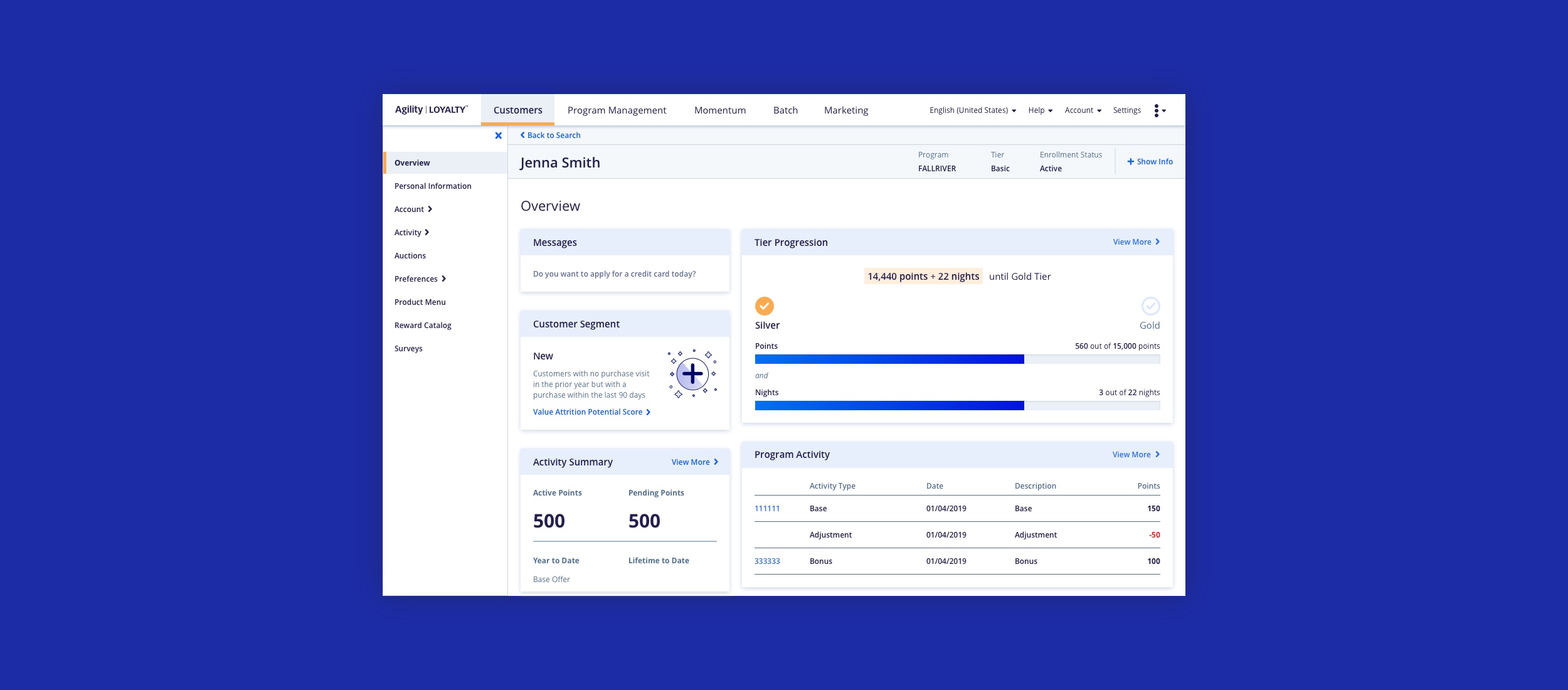
Loyalty customer segments
The CSR would see the customer segment tile on the customer's overview dashboard. The tile appears at the top of the page because it suggests to the CSR how best to help each customer.
Next project
